It’s more important today than ever that digital marketers can make informed decisions easier and faster. KPIs, when used effectively, provide a powerful tool for achieving that. One of the solutions to create interactive reports is Klipfolio, but it isn’t without its own limitations.
Like every other marketer, you want to use the best software to report KPIs with other stakeholders or your team. You may feel overwhelmed with where to start, but in this article, I’ll introduce you to the 9 best Klipfolio alternatives you can customize to suit your reporting needs in 2024.
Why consider alternatives to Klipfolio?
Learning curve
First off, it’ll take you some time to set up the platform and get up to speed with Klipfolio. The syntax for formulas and function names differs from Excel or Google Sheets, which will also take a while to get used to the differences.
Higher entry price for paid plans
While there's a generous free plan, there's a big gap after it to access premium features, jumping right up to $99/month. Other dashboard tools will allow you to have a smaller number of premium dashboards for a lower price.
Data source limit
Last but not least, Klipfolio users who deal with Excel or CSV files are restricted by a 10MB data source limit. This makes users monitor their data source regularly to ensure it remains within limits.
Here are the 9 best Klipfolio alternatives
- DashThis
- Yellowfin
- ClicData
- Zoho Analytics
- Grow
- Databox
- Sisense
- Countly
- Rakam
1. DashThis
Best suited for: marketers who need to track and share metrics from multiple channels with ease
Free trial: yes, 15 days. Sign up here.
Starting price: from $33/month
Key features
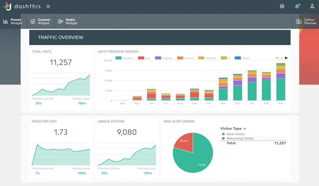
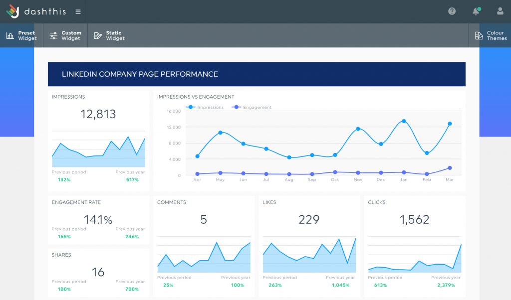
DashThis is a marketing reporting and dashboard tool to build custom dashboards for PPC, social media, email, sales, and eCommerce.
It's similar to Klipfolio, but focuses entirely on marketing dashboards, and can't cover other use cases like sales or customer support KPIs.
DashThis's biggest advantage is that it's simple to use, thanks to its drag-and-drop interface. Without coding or business intelligence knowledge, even non-technical users can easily link all their marketing data sources into a single location.
DashThis strives to make data more accessible: it eliminates the need to look at data from multiple sources side-by-side. You can have widgets built on several data sources within a single dashboard from any combination of integrations you need.
Furthermore, DashThis has great customer support with everything from email, a dedicated account manager, priority support, and 1-on-1 screen-sharing sessions.
DashThis vs Klipfolio
- Price-wise, DashThis is a more affordable solution for a smaller number of dashboards. The cheapest plan on DashThis starts from $33 per month whereas Klipfolio’s starter plan costs $99 per month.
- To get PDF versions of your dashboards, you’ll have to pay 3 times more per month with Klipfolio than DashThis.
- Klipfolio is a low-code platform requiring some coding know-how in some use cases. For example, building timeline-based visualizations may require you to have some programming knowledge. With DashThis, creating any kind of chart with zero technical knowledge is simpler.
- Klipfolio offers a freemium plan (with only 2 editor users), unlike DashThis.
Pricing
DashThis has 4 plans: Individual, Professional, Business, and Standard. The ‘Individual’ plan costs $33 per month (billed annually) or $39 per month (billed monthly). All DashThis plans come with multi-source dashboards and unlimited users. See full pricing here.
2. Yellowfin
Best suited for: mid-sized to large organizations who need a reporting and data analytics tool solution with automated AI and ML features
Free trial: Yes, 30-day free trial. Sign up here.
Starting price: unknown
Key features
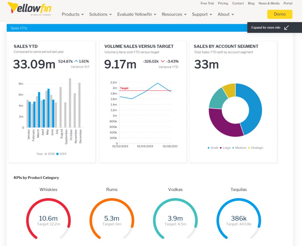
Yellowfin is enterprise-level business intelligence, reporting, and analytics software to simplify the entire analytics workflow, build dashboards, and prepare business reports.
With Yellowfin, you can enhance your dashboards with assisted insights and automated business monitoring. Thanks to its ML capabilities, you ask a question and the tool analyzes your data instantly and gives you the insights.
You can impress your customers with fully white-labeled dashboards, which can be embedded into any application’s workflow to drive better decision-making.
Yellowfin vs Klipfolio
- Yellowfin is a more robust solution with advanced features, such as smart data visualizations with natural language explanations, data transformation, and AI-driven automated analysis.
- Yellowfin dashboards are extendable – you can create animations or custom filter controls through coding languages like HTML, CSS, and JavaScript.
- Klipfolio offers a freemium version, unlike Yellowfin.
Pricing
Yellowfin doesn’t provide information on pricing on its website. You can request a quote here.
3. ClicData
Best suited for: small to medium-sized organizations needing a reporting tool with strong out-of-box integrations with many third-party solutions
Free trial: yes, 15 days. Sign up here.
Starting price: from $73/month
Key features
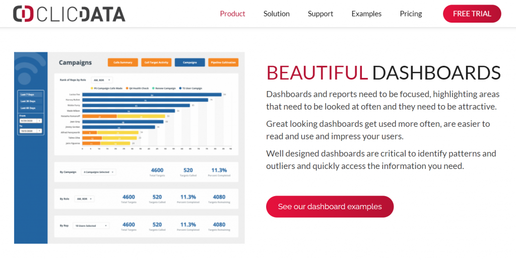
ClicData is a business intelligence, data warehousing, and reporting solution to connect, blend, and visualize data using different databases.
You can bring data from over 100 business applications (like Zapier or Hubspot), cloud or on-premise databases (like Google Big Query or Amazon RedShift), and files (like Dropbox, Excel, or Google Drive) in a single place.
ClicData’s data management capabilities allow you to merge data from multiple sources into a single table and use specific formulas to create new calculated columns.
Lastly, with its API, you can build innovative web and mobile applications that deliver instant notifications and alerts and display dashboards in real-time.
ClicData vs Klipfolio
- ClicData’s starting plan ($73/month) comes with 5 users while Klipfolio’s starting plan ($99/month) comes with only 4 users.
- Klipfolio offers some classic SEO and analytics applications like Semrush, Moz, Ahrefs, and Google Search Console, which ClicData doesn’t.
Pricing
ClicData has 4 plans: Personal, Team, Business, and Enterprise. The ‘Personal’ plan costs $73 per month (billed annually) or $79 per month (billed monthly). It comes with unlimited dashboards with over 50 types of visualization widgets. See full pricing here.
4. Zoho Analytics
Best suited for: businesses need a reporting solution with data preparation and analysis features
Free trial: yes. Sign up here.
Starting price: from $24/month
Key features
Zoho Analytics is data analysis, business intelligence, and reporting software to analyze your data, create stunning dashboards and uncover new insights from the business data.
It connects to a multitude of sources like files (CSV and JSON), classic business applications, and cloud and on-premise databases. Some of its famous connectors are Google Analytics, Hubspot, Facebook ads, and Google Search Console.
With its data management features, you can easily cleanse and transform the data that you want to analyze. Use ML techniques to enrich data with sentiment analysis, language detection, keyword extraction, and more. Zoho Analytics has a smart assistant and you can have conversations with it in natural language to generate automated insights with a single click.
Zoho Analytics vs Klipfolio
- Zoho Analytics let you connect with over 250 data sources whereas Klipfolio connects with around 140 applications.
- Zoho Analytics has more premium features such as ‘smart cleanse’ to improve the quality of your data and ‘what-if analysis’ capability to simulate complex scenarios and discover optimal business outcomes.
Pricing
Zoho Analytics has 4 plans and the starting plan costs $24 per month (billed annually) or $30 per month (billed monthly). See full pricing here.
5. Grow
Best suited for: small to medium-sized organizations who need to track the right KPIs via interactive dashboards
Free trial: yes. Sign up here.
Starting price: unknown
Key features
Grow is a no-code data analytics, dashboard, and reporting software to connect and blend data from hundreds of data sources and create business dashboards.
Grow’s out-of-box integrations connect to the most commonly used platforms, databases, CRM (like Salesforce, HubSpot, and Pipedrive) applications, and social media channels to import data seamlessly via APIs that continually import and refresh data, so your KPIs remain up-to-date.
With its ETL capabilities, you can use the no-code transforms via custom calculations or joining (left, right, outer, inner, or cross). You can also write custom PostgreSQL to transform 1 or more tables.
Grow vs Klipfolio
- Grow is a better alternative in merging and transforming disparate data sources, and then exploring different visualizations as you navigate your data.
- With Grow, it’s possible to see how much data you have stored in your software, as well as any issues with data that need attention.
Pricing
Pricing information for Grow isn’t available, you can request a demo here.
6. Databox
Best suited for: marketers who want to get a holistic view of marketing performance with ease
Free trial: yes. Sign up here.
Starting price: from $72/month (+$250 for white label features)
Key features
Databox is a business analytics and reporting platform to pull all of your data in one place, build reports, and present KPIs in easy-to-understand dashboards. It integrates with over 70 applications and data sources, including Hubspot, Google Sheets, Facebook ads, Shopify, and others.
Databox has hundreds of dashboard templates across all departments, including marketing, sales, customer support, finance, and project management. Select a template, connect your data, and your metrics will show up automatically.
Databox is a highly customizable client dashboard software, so every visualization can go as in-depth as you’d need. Furthermore, with its data calculations, you can merge data from different sources and calculate new metrics, KPIs, or conversion rates – all without coding.
Databox vs Klipfolio
See a full comparison of Databox vs Klipfolio here.
- The general interface of Databox is slightly more intuitive than that of Klipfolio. Overall, it's easier to use, has more templates, and quicker support.
- All Klipfolio plans come with unlimited dashboards, which aren’t available on Databox.
Pricing
Databox has 4 plans: Free-forever, Starter, Professional, and Performer. The ‘Starter’ plan costs $72 per month (paid annually) or $91 per month (paid monthly) and with that plan, you can build 4 dashboards. View full pricing here.
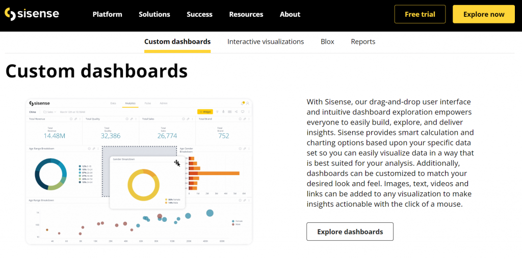
7. Sisense
Best suited for: enterprise-level businesses needing a BI solution with advanced features like data modeling and embedding
Free trial: yes. Sign up here.
Starting price: unknown
Key features
Sisense is a business intelligence and reporting software to derive valuable insights through business dashboards. With Sisense, you can connect all your data in a singular place, benefiting from over 100 data connectors.
Its drag-and-drop user interface and intuitive dashboard exploration empower you to create dashboards and generate business insights. It also provides smart calculation and charting options based on your data so you can visualize data in a way best suited to your requirements.
Furthermore, Sisense allows you to forecast future values based on your historical data. Its forecast settings let you change a parameter and see how it affects future values, so you’ll understand which scenario will help make the right business decisions.
Sisense vs Klipfolio
- Sisense has more premium features. For instance, you can augment every analysis with predictive analytics and machine learning.
- Sisense may be buggy sometimes, and some dashboards may return errors with no insight into the source.
- Because Sisense has a lot of advanced features, many users will likely find it to be complicated.
Pricing
Sisense offers customized pricing and doesn’t provide the full pricing information on its website. You can get pricing info here.
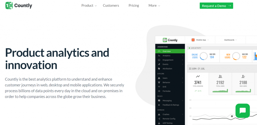
8. Countly
Best suited for: product teams who need to track product performance, customer journey, user profiles, and engagement in real-time
Free trial: unknown. Get a demo here.
Starting price: unknown
Key features
Countly is a product analytics solution to enhance customer journeys in web, desktop, and mobile applications. Answer your complex product-related questions with Countly by drilling down into granular data without writing any queries.
With Countly, you can explore user behavior on an individual level of detail – track individual-level customer sessions, custom event activity in each session, and funnel completions.
Using Countly’s dashboards plugin, you can create as many dashboards as you wish to visualize data from different applications using time series, bar charts, tables, or other widgets.
The software also allows you to get email alerts based on personalized metric changes, so you’re notified about changes in your data like an increase or decrease in new users, occurrence count of an event, or errors.
Countly vs Klipfolio
- Countly is better suited for product teams. It lets you perform advanced queries on all your customer data and actions.
- Countly has very unique features. For example, its crash analytics capabilities allow you to prevent crashes in your mobile apps before they start to impact your processes.
Pricing
Countly has 2 plans: Enterprise Edition and Community Edition. The ‘Community Edition’ plan is free. View full pricing here.
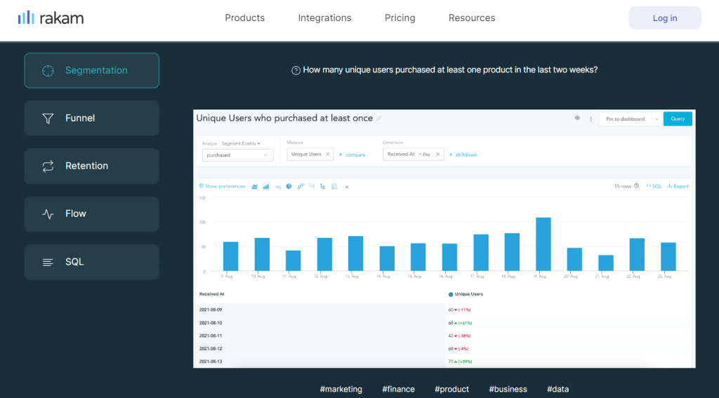
9. Rakam
Best suited for: marketing and product teams who need to connect to their data warehouse and run queries efficiently
Free trial: unknown. Get a demo here.
Starting price: from $25 per user/month
Key features
Rakam is a product analytics solution that analyzes user behavior using features like funnel, segmentation, and retention.
With Rakam, you can track and compare all your marketing spend across various channels, dig into user behavior with retention reports, and uncover all user journeys in one platform.
Rakam has native integrations with data warehouses and analytics solutions, including Google Analytics, Firebase, Google Big Query, and Amazon Redshift.
Create dashboards using the drag and drop interface and collaborate with your teams by sharing dashboards as links or CSV. If you want to enrich your apps, Rakam offers to embed analytics and white label feature to deliver an analytics experience within your existing application.
Rakam vs Klipfolio
- Rakam is a better alternative for product data. You can connect it to your raw event data and run complex behavioral analytics queries without compromising performance.
- Rakam has a limited number of connectors whereas Klipfolio integrates with about 140 applications and data sources.
Pricing
Rakam pricing is based on the number of people using Rakam. It has 3 plans: Startup, Growth, and Enterprise. The ‘Startup’ plan is free for up to 2 users and this plan comes with features like segmentation reporting and behavioral analytics. View full pricing here.