If you're looking for an interactive product demo software for marketing, Navattic & Tourial are among the market leaders. They're fast to implement & effective, but what's the difference between them?
We'll explore:
- The short summary (main differences)
- Pricing differences
- How they work (capture methods)
- Integrations
- Time to implementation
- Example demos built using each tool
Let's start with the ‘TL;DR'.
The difference between Navattic vs Tourial
The main difference between Navattic and Tourial is that Navattic captures product shots with HTML & CSS, while Tourial uses screenshots & videos. They both primarily serve marketing / top-of-funnel use cases (rather than sales teams). Pricing models are similar, but Navattic's entry price is lower.
| Reasons to choose Navattic | Reasons to choose Tourial |
| Easier to customize each demo screen | Showing longer/complex workflows |
| More realistic feeling demos | Show live actions e.g.. drag/drop with video |
| Lower entry pricing | Make demos from design files (e.g. Figma) |
| More ways to utilize demo usage data | Chili Piper/Calendly integration |
| Get a Navattic demo | Get a Tourial demo |
Their pricing models are similar
To start, both platforms:
- Include unlimited user seats in every plan
- Include unlimited demos / demo views in every plan
- Price based on company size
Navattic‘s pricing is publicly available: $300/mo Start up plan (less than 20 employees.) $500/mo for ‘Base' (company size up to 100 employees & base features), and $1,000/mo for larger companies. The $1k plan also includes extras like SSO & dedicated success managers/coaching.
Tourial‘s pricing has two tiers, based on company size. <50 people is $790/month, and 51+ people is $1,170/month. Simple. Every plan includes every feature, and dedicated CSM/consultation.
1. How they work: HTML capture vs. screenshots/videos
Since these tools fundamentally work differently, there's a few key pros & cons to either side. I'll summarize them here; you can decide what is important to you.
Strengths of Navattic‘s method (HTML capture) & features
1. Demos feel more realistic. If you put a HTML captured demo next to a screenshot captured demo, you can tell the difference. To check, look at their own demos: Navattic, Tourial.
2. You can customize screens more easily. When you capture code, you can click into text & change it, or clean up data in charts (etc.). Navattic also has tools for blurring out & deleting data you don't want to show. Those things aren't possible with screenshots.
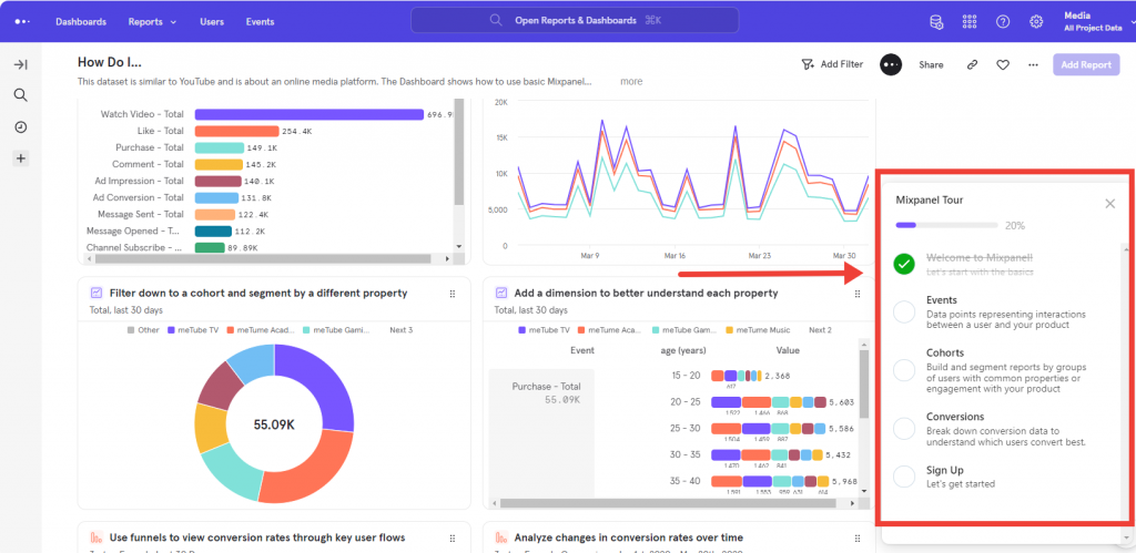
3. Choose your own journey. Navattic has branching options to let people choose the most relevent demo. Plus, there's also a checklist feature which allows non-linear tours. People can jump around dependent on what's most important to them. Tourial doesn't have this.
Strengths of Tourial‘s method (screenshots/videos) & features
Why might you consider Tourial as an alternative to Navattic?
1. Showing longer workflows. It can get pretty tiring to keep clicking ‘next' during a product tour. In Tourial, you can utilize videos to speed through complex sections and reduce click fatigue. That isn't possible with Navattic.
2. Avoid capture issues with complex features. If you're using an outdated tech stack, or you have complex features (e.g. 3d modelling), it's difficult to clone your product with HTML. Using screenshots & videos, you'll never have any issue of that nature.
3. Use unreleased features in demos. If you're using screenshots, you can just as easily use a Figma file for your demo, even if it isn't released yet. That might be helpful for promoting an upcoming release, or even just starting a product marketing workflow earlier so that you're ready for release.
Tourial also has a feature called TourPlayer which lets you build a “playlist” of demos. Of course you can still build a library of demos without the feature, but especially for a solo marketer, that makes it easier. You can see an example in Tourial's Demo Center.
A note on mobile demos
Both Navattic & Tourial are capable of making mobile demos, but neither would ensure your desktop demo is automatically responsive. You'd have to create separate mobile-dedicated demos.
2. Differences in integrations
Summary: Both tools integrate with Salesforce/HubSpot CRMs. Navattic offers more flexibility in how you use data with Segment & Zapier, while Tourial enables a slicker call booking experience with Chili Piper/Calendly.
| Shared integrations | Unique to Navattic | Unique to Tourial |
|---|---|---|
| Salesforce | Zapier | Chili Piper |
| HubSpot | Google Analytics | Calendly |
| Marketo | Segment | Pardot |
| Slack |
Let's look quickly at the practical impact of these differences.
For Navattic, the key integrations advantage is flexibility of how you use your demo data. For example, with Segment, you can push demo interaction data into any tool (e.g. Amplitude, Intercom) for other automations. Equally, Zapier unlocks no-code automation possibilities too. For example, even though Navattic doesn't have a direct Slack integration like Tourial, it's possible to create the same thing in Zapier.
For Tourial, the biggest integrations advantage is the scheduling tools. You can directly embed the calendar booking UI into your tour, making a slick experience to book calls.
Tourial's roadmap also includes adding more integrations with martech like chatbots & scheduling tools — though I can't share anything specific.
3. Time to implementation
Summary: Implementation time probably isn't much of a deciding factor here (both are fast).
Navattic & Tourial are both on the faster end of the spectrum when it comes to implementation time. From idea, through the buying process, to publishing your first demo — both would be faster than a platform like Reprise, Demostack, or Walnut.
Either tool can get your first demo published within an hour.
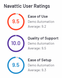
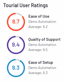
G2 reviews suggest that Navattic is slightly easier to use / set up.
Example demos
Curious what demos made with Tourial or Navattic actually look like? Here's a couple made by each tool.
Built with Navattic
Dooly
See it live: https://www.dooly.ai/see-dooly-in-action
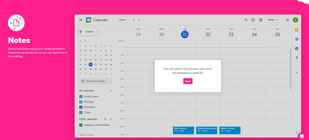
Dooly's interactive demo is split into 6 flows to showcase each feature. It's a straightforward walkthrough that gives the user an idea of how it looks/feels to use the product.
Gorgias
See it live: https://www.gorgias.com/product-tour
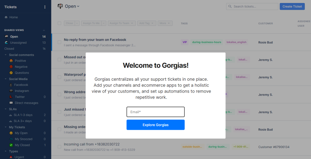
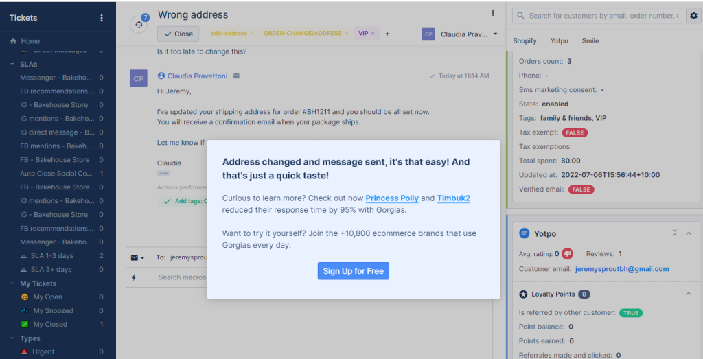
Gorgias have an example of a gated interactive demo which requires an email to view, although it's worth noting that Navattic enables ungated demos too — you can choose which you prefer.
It's a straightforward walkthrough of the main features, ending by offering customer stories and a self-serve sign up CTA.
Built with Tourial
Northpass
See it live: https://www.northpass.com/
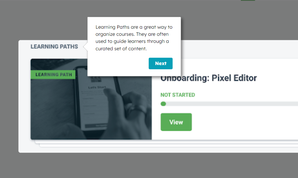
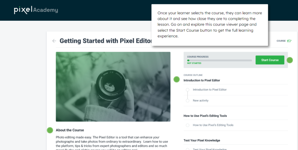
Northpass' interactive tour is front and center in the hero section of their homepage. It provides a simple walkthrough of the main features, and outside of the ‘main' flow, users can choose to click on additional points of interest:
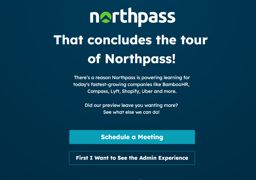
The end screen offers either a call booking link, or the option to head straight into the next tour:
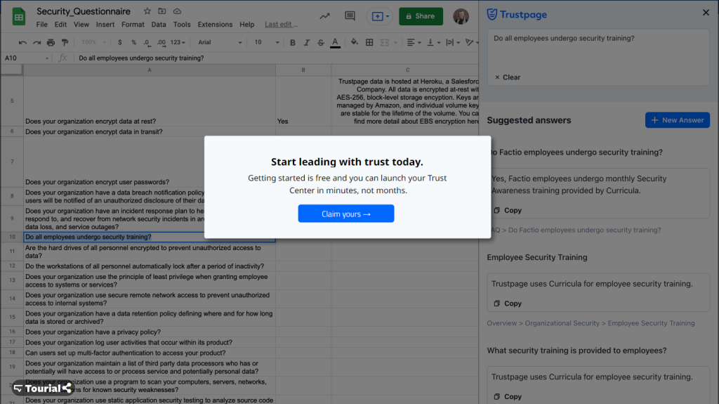
Trustpage
See it live: https://trustpage.com/
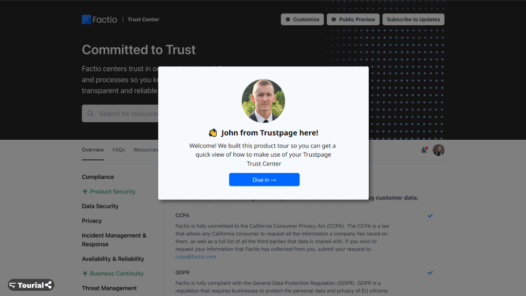
This is a pretty standard example, and they use a ‘Tour the product' CTA directly in the homepage hero section. The tour ends with a sign up CTA. Nothing much more to say here!
For a mobile demo built with Tourial, you can check https://tourial.aforza.com/rex.
Summarizing
Both are solid tools with happy customers and great teams behind them. I think this is the main thing to remember:
HTML capture looks more realistic, & lets you edit each screen.
Screenshot & video capture has more flexibility to show more functionality, and overcome any technical issues.
Both tools are also developing fast, so be sure to check for recent updates if you're reading this a few months past the publish date 🙂
