The more KPIs you have, and the more team members you have, the trickier it gets to keep track and make good decisions.
KPI dashboard tools let you pull together all the relevant goals, metrics and KPIs in a central place to keep track. They make data easier for teams to understand, analyze, and act on.
Yet, choosing what KPI dashboard tool to try out may become confusing. In this post, I’ll walk you through 9 KPI dashboard tools for different purposes, including tools for tracking marketing KPIs, product KPIs, and more.
Overview: 9 best KPI dashboard tools
The below table provides a quick outline of the top 9 KPI dashboard tools I'll discuss in greater detail in this post.
| Tool | Price range | Top features | Use case |
| DashThis | 4 plans from $33/month to $339/month | 34+ marketing integrations, 50+ report templates, unlimited users, shareable URLs, white label | Marketing KPIs |
| Domo | Personalized quote | 1000+ pre-built cloud connectors, many file format (PDF, CSV, Excel spreadsheet) uploads, and natural language queries | Business Intellgience |
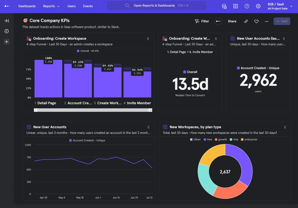
| Mixpanel | One free plan, 2 paid plans from $25/month | 50+ connections to top tools, interactive analysis directly from Snowflake, BigQuery, or Redshift | Product KPIs |
| Scoro | 4 plans from $26/month to $63+/month | 1000+ connections to CRM, sales, and many tools, automatic notifications, deadline alerts, and live dashboards | Sales & Finance KPIs |
| BrightGauge | 3 plans from $289/month to $559/month | 50+ integrations, client reporting, and report automation | Sales & Marketing & Customer success KPIs |
| Yellowfin | Personalized quote | Automated insights produced by AI and Machine Learning, automated business monitoring, and threshold alerts | Business Intellgience |
| Databox | One free plan, 3 paid plans from $72/month to $231+/month | 70+ integrations, 200+ pre-built reports, calculated metrics, and automated dashboards | Sales & Marketing KPIs |
| Megalytic | 4 plans from $39.99/month to $399.98/month | White-label dashboards, SEO/PPC/website performance report templates, and scheduled report delivery | Marketing KPIs |
| Toucan Toco | Personalized quote | 100+ integrations, easy to use analytic story-telling, and white-label dashboards | HR & Sales & Software KPIs |
1. DashThis
Best suited for: marketers who want to track & share KPIs from multiple channels easily
Free trial: yes, 15 days. Sign up here.
Starting price: from $33/month
Main features
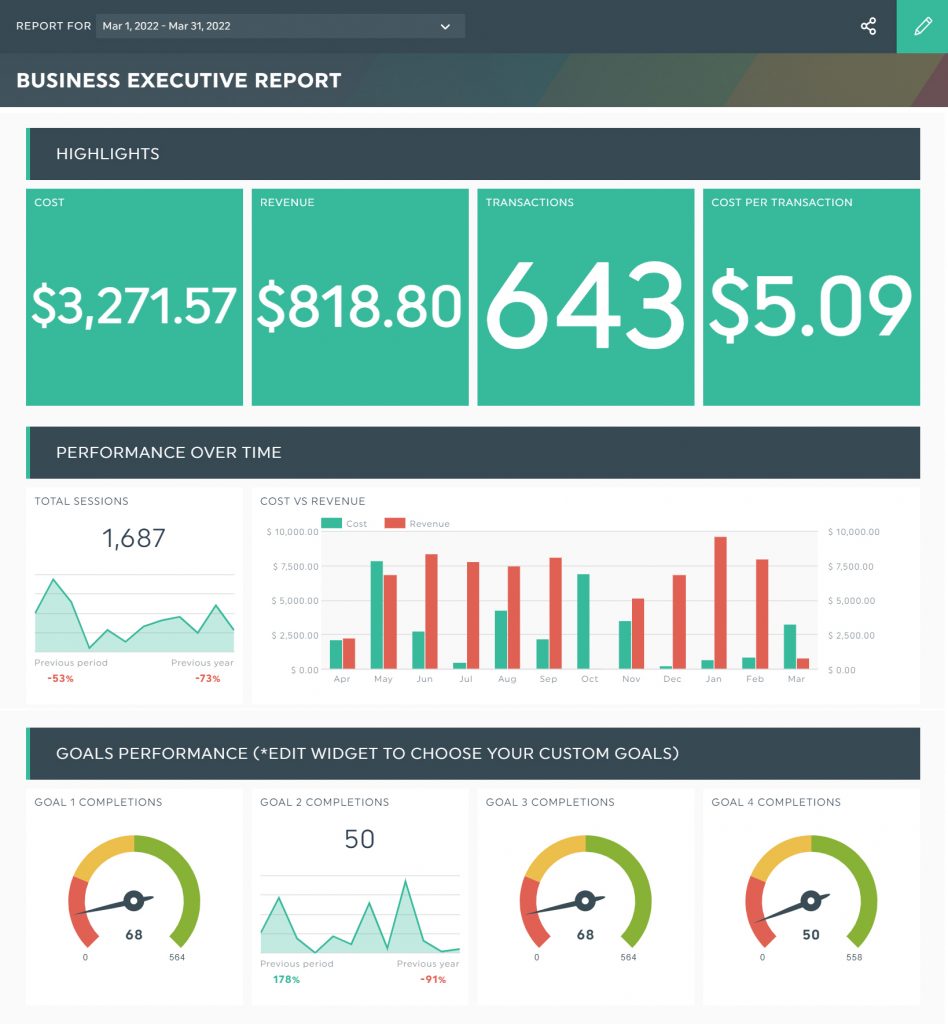
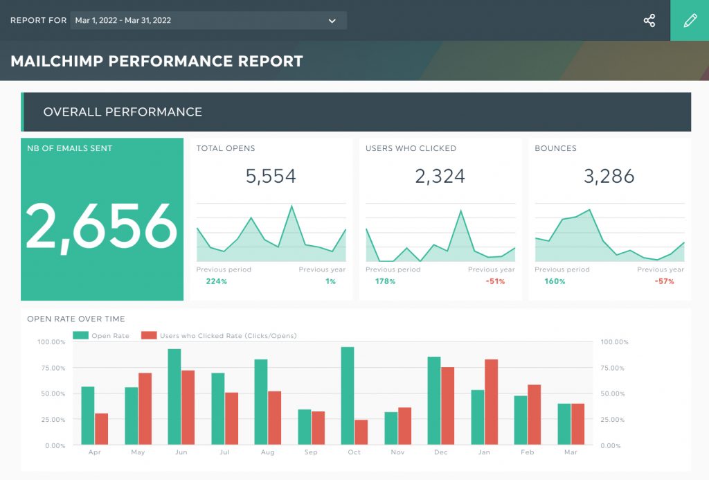
DashThis is a marketing reporting tool that lets users build custom dashboards for SEO, social media, SEM, and paid campaigns reports.
The biggest strength of DashThis is that it’s easy to use, with a drag-and-drop interface. Even non-technical users can enjoy the possibility to connect all their marketing data sources – CRM, web analytics, Google Sheets, and advertising – in one place without any coding or business intelligence experience.
DashThis has plenty of report templates to choose from, which means that you’re working with a tool that gives you a starting point to build your unique dashboard and have an in-depth overview of important KPIs quickly.
A simple drag and drop interface and intuitive dashboard exploration are other strengths of DashThis which basically saves you a lot of time.
With DashThis, you can send white-labeled reports with a custom domain to your clients or colleagues using a shareable URL. You can also setup automated email reports on a monthly, weekly, or daily basis.
Additional DashThis features are:
- Automated reports
- PDF exports
- Access controls & permissions
- Customizable branding
- Commenting & notes
Pricing
DashThis has 4 pricing editions: Individual, Professional, Business, and Standard. The ‘Individual’ plan starts at $33 per month when billed annually or $39 per month when billed monthly. This plan comes with an unlimited number of users and integrations. See full pricing here.
2. Domo
Best suited for: mid-size to large companies with advanced reporting requirements and minimal technical expertise
Free trial: Yes. Sign up here
Starting price: Unknown
Main features
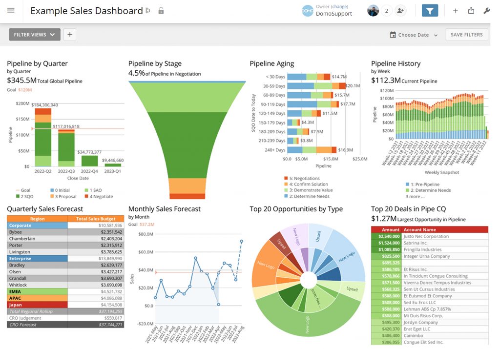
Domo is a data integration platform that offers business intelligence, data visualization, dashboarding, and reporting altogether. This tool is used for more general business data, not specifically for marketing data.
In the first place, with over 1000 pre-built connectors, Domo eliminates time-consuming and expensive engineering projects. Whether your data sits in the cloud, on-premise, or in a flat file, Domo supports bi-directional connections between all systems. So, Domo’s greatest strength lies within its connectors.
Domo’s plug-and-play dashboards will help you answer specific questions and business needs, thanks to its pre-built visualizations for common data sources like Salesforce, Adobe Analytics, and others. You can also export visualizations and raw data to many formats such as CSV, XLS, PDF, and PPT.
Domo is a user-friendly tool with high product functionality. Its calculations function in the language of Microsoft Excel. With Domo’s straightforward drag-and-drop interface, your data integration and visualization process will be more simple.
Additional features include:
- Ad hoc analysis
- Budgeting & forecasting
- Predictive analytics
- Time series analysis
- Mobile dashboards
- Multi-user collaboration
- Real-time updates
Pricing
Pricing for Domo is based on different components related to data storage, data refresh rates, the volume of data queries, and the number of users. To find detailed pricing for Domo, you can contact sales.
3. Mixpanel
Best suited for: product teams tracking product usage KPIs
Free trial: Free plan. Register here.
Starting price: from $25/month
Main features
Mixpanel is a product analytics tool that lets you analyse and visualize the data with just a few clicks. This makes it easy to answer questions like how users use your product, who sticks around, and how frequently users perform meaningful actions.
Mixpanel offers an accurate analysis of user behavior for mobile and web applications. It provides well-segmented data in a consumable format in which you can delve into each step and level of user engagement in real-time and discover various funnel metrics.
Furthermore, Mixpanel offers over 50 integrations to help you bring in all of the right data and trigger targeted actions throughout your stack. The most popular Mixpanel integrations include Zoho CRM, Mailchimp, Databox, Slack, Facebook ads, Zendesk, and many more.
Although the learning curve for Mixpanel is steep, its detailed documentation of all the essential features will help the users in their journey.
Some of the additional features that Mixpanel offers are:
- Conversion tracking
- Predictive analytics
- Geotargeting
- Funnel analysis
- Website analytics
Pricing
There are 3 Mixpanel pricing plans: Free, Growth, and Enterprise. The ‘Growth’ plan starts at $25 per month (billed annually) or $36 per month (billed monthly), allowing you to track 1000 unique visitors per month. Basically, the more unique visitors you need to monitor, the more you’ll pay. See full pricing here.
4. Scoro
Best suited for: small and medium-sized businesses that need a multipurpose platform
Free trial: Yes, 14-day free trial. Sign up here.
Starting price: from $26/month (no credit card required)
Main features
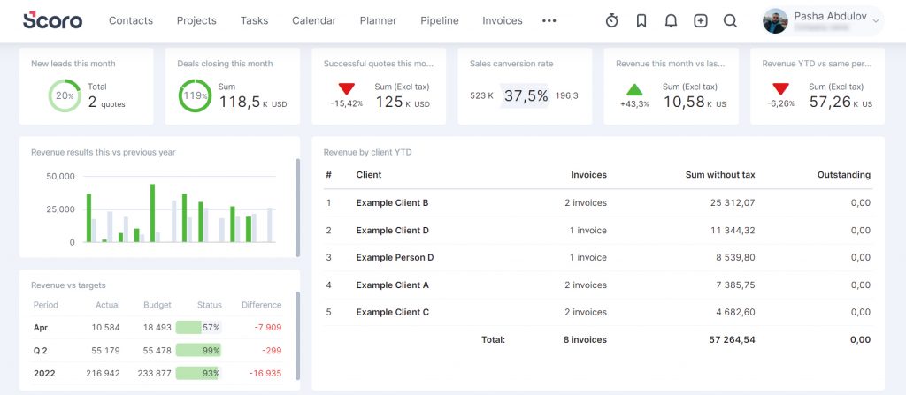
Scoro is a business/project management and CRM platform to track all your business processes from a single dashboard.
With Scoro’s dashboard capabilities, you can easily track performance and KPIs, detect bottlenecks and opportunities, and plan for the future with real-time dashboards without having to wait for data to refresh. Additionally, you can create unique shareable dashboards for every team within your organization to provide a full overview of everyone's targets and KPIs.
Scoro integrates seamlessly with many task management and marketing platforms so you can supercharge the way you work. For example, Scoro’s integration with Slack lets you create projects from Slack channels and new tasks from messages. Or its Facebook ads integration allows you to create or update leads, tasks, and events in Scoro based on new leads from Facebook.
Additional features include:
- To-do lists
- Calendar view
- Data consolidation
Pricing
Scoro offers 4 pricing editions: Essential, Standard, Pro, and Ultimate. The ‘Essential’ edition starts at $26 per user per month (billed annually) or $28 per user per month (billed monthly). If you’ll need to sync with platforms like Zapier and Google Drive, you’ll have to upgrade to the ‘Standard’ plan that starts at $37 per user per month. See full pricing here.
5. BrightGauge
Best suited for: mid-size to large enterprises and IT service providers that need to put business development, customer service, and finance KPIs in one place
Free trial: Yes. Request a demo here.
Starting price: from $260/month
Main features
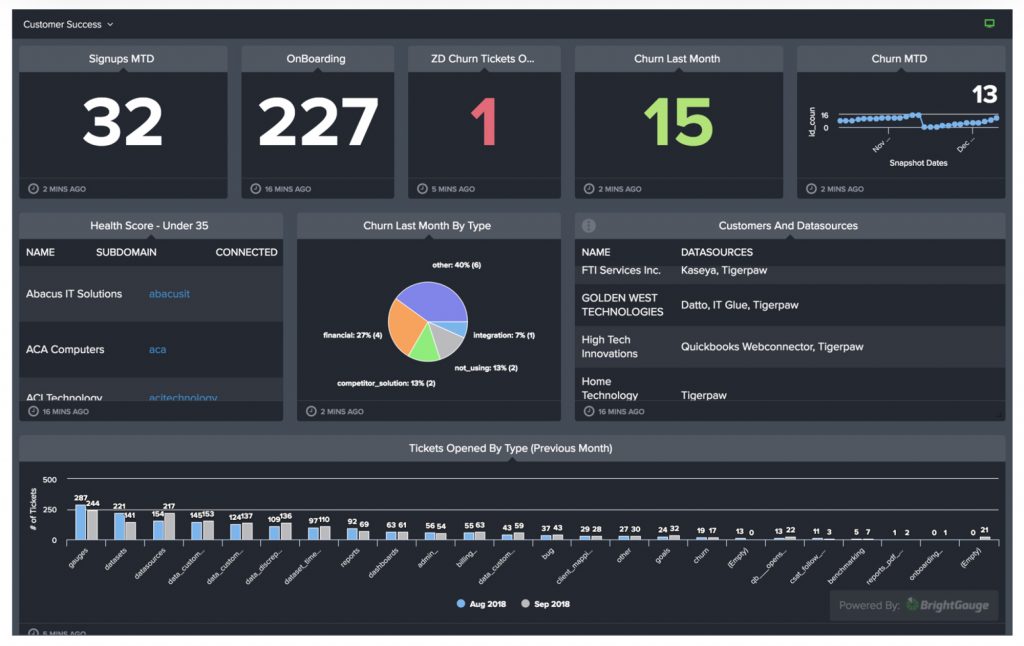
BrightGauge is a data visualisation and business intelligence solution that allows you to organize KPIs and information from multiple sources with real-time dashboards.
Its ability to integrate with multiple marketing, sales, and customer service data sources is a very important feature that will eventually provide more effective decision-making. BrightGauge integrates with Salesforce, Dropbox, OneDrive, Zendesk, RingCentral, and SQL-centred databases.
If you want to build strong client relationships, BrightGauge’s client reporting features are what you’re looking for. When you visit your ‘Reports’ section, you'll be able to send a report to your clients the way they want it.
Additional BrightGauge features include:
- Datasource mashup
- Calculated metrics
- Scorecarding
- Goal management
Pricing
BrightGauge offers 3 plans: Standard, Enterprise, and Enterprise+. The ‘Standard’ plan starts at $260 per month when billed annually or $289 per month when billed monthly. See full pricing here.
6. Yellowfin
Best suited for: start-ups and small organizations that want to manage and automate their whole analytics environment
Free trial: Yes, 30-day free trial. Sign up here.
Starting price: Unknown
Main features
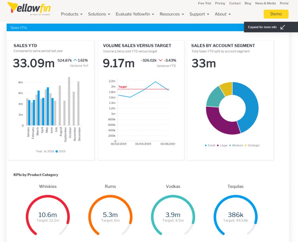
Yellowfin is an analytics platform that combines action-based dashboards with automated analysis and data storytelling.
Firstly, Yellowfin is very easy to set up and within a few hours, you’ll be ready to make it work fully. The interface is user-friendly so it won’t take long for you to train your team to use it.
Second, Yellowfin users can access weekly, monthly or quarterly retrospectives that explain what happened in the data with a story widget.
In addition to the 50 out-of-the-box charts, this tool also allows you to build your own utilizing your favorite JavaScript charting libraries like D3, Highcharts, and three.js.
Additionally, you can augment your dashboard building with assisted insights, automated business monitoring, and machine learning integration. Ask a question and Yellowfin will automatically analyse your data and give you the answer with high efficiency.
Additional Yellowfin features include:
- Automated data discovery
- Calculated fields
- Integration APIs
Pricing
Yellowfin doesn’t provide information on pricing on its website. You can request a quote here.
7. Databox
Best suited for: marketers who want to get set up with one-click integrations and dashboards quickly
Free trial: yes. Sign up here
Starting price: from $72/month (+$250 for white label features)
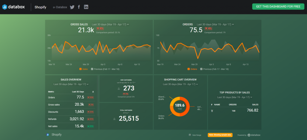
Main features
Databox is a business analytics KPI solution that provides a 360-degree view of your data in one place.
The biggest strength of Databox is probably its over 70 integrations, meaning you can easily connect with different applications associated with CRM, data warehousing, sales, advertising, project management, eCommerce, and customer support.
Secondly, Databox provides hundreds of pre-built templates for specific use cases that can be used as-is or modified as needed.
Last but not least, Databox allows you to dig deeper into your performance with calculated fields that will help you generate more actionable insights depending on your specific business requirements.
Additional Databox features include:
- Mobile dashboards
- Predictive analytics
- Data calculations
- Real-time updates
- Automated reports
- SQL database integrations
- Google Sheets integration
Pricing
There are 3 Databox plans available: Starter, Professional, and Performer. The ‘Starter’ plan starts at $72 per month (billed annually) or $91 per month (billed monthly), allowing you to create 4 dashboards. You can also create a ‘Forever Free’ account that lets you build 3 dashboards only. See full pricing here.
8. Megalytic
Best suited for: digital marketing agencies that need a budget-friendly reporting and dashboard solution
Free trial: Yes. Sign up here.
Starting price: from $39.99/month (no credit card required)
Main features
Megalytic is a marketing reporting and dashboarding tool that collects data from various sources and transforms them into comprehensive reports.
Firstly, Megalytic allows you to gather all the marketing data together – traffic, conversions, impressions, CPC – to tell a story about how your marketing is performing. You can easily email the reports to your clients as PDFs or present them on responsive web pages that can be read on a phone or desktop.
With Megalytic's pre-built SEO, PPC, and other templates, you'll be better off. Each time you need a report for a new client, you start from the template, and most of the work is done. On top of that, you can customize each client's report to fit their needs and brand identity.
What’s more beautiful is that Megalytic reports can be set to update your clients’ data automatically each month or week so you won’t need to refresh anything.
Additional Megalytics features are:
- Real-time updates
- Customizable branding
- Automated reports
Pricing
Megalytic for reporting comes with 4 plans: Basic, Standard, Premium, and Enterprise. The ‘Basic’ plan starts at $39.99 per month and allows you to create 10 reports. See the full pricing here.
9. Toucan Toco
Best suited for: marketers and small businesses with limited technical expertise who are looking for a simple and responsive dashboard tool
Free trial: Yes, 15-day free trial. Sign up here.
Starting price: Unknown
Main features
Toucan Toco is an analytics and reporting tool to create custom charts and graphs from large data sets. Complex actions that once used to take specialists can now be done visually and by novice users.
Toucan Toco's built-in agility lets you bring all of your data together in a single platform and turn it into actionable information. From Salesforce, Google My Business to Google BigQuery, Oracle, Toucan connects to nearly any data source in minutes.
No-code data preparation is another strength of Toucan Toco. Any beginner-level user can now do complex actions that once used to take specialists.
Additional Toucan Toco features are:
- Customizable branding
- Data transformation
- Natural language search
- Predictive analytics
- Scheduled reports
- User management
Pricing
Toucan Toco doesn’t provide information on pricing on its website. You can request a quote here.
Use a KPI dashboard software and put your most important metrics in front
It’s simply not enough just to have data for marketing, product, finance, and customer information. That data has to be managed and transformed into KPIs that are important to you and your team so you can seize opportunities and uncover problems through visuals.
This post provides you with my 9 top picks for KPI dashboard software. Which of these tools are you planning to use, and why?