Building an interactive demo is one of the best ways to help users understand the value your product brings.
Hidden behind a sign up form, 90-95% of your website traffic isn't going to get to experience your product. Using an interactive demo software to offer an ungated experience means a lot more eyeballs on your actual product, and a lot more people reaching that ‘aha' moment — even before they sign up.
So, where do you start? By looking at examples for inspiration 😄.
First, a few rapid-fire tips. (or, skip straight to the examples 👇)
What makes a good interactive demo?
Start with your goal
Are you trying to drive demo calls? Self-serve sign ups? Enable your ‘champion' within the prospect's team to show off the product more easily? Think about this in advance, and it'll impact some decision-making.
Understand who will be using it
Will the demo be available publicly, or only used as a leave-behind or to send prospects? If it's embedded, which pages will it be on? Which traffic sources are driving people to those pages) What level of intent & knowledge will those users have?
Draft your storyboard template
A good storyboard should ensure that the demo flows nicely, and it'll speed up the work once you start making it. Focus on getting to those “a-ha moments” as fast as possible. For complex products, figure out how to break down the demo, e.g. by features or use cases. Let users choose their own journey where possible.
11 interactive demo examples for SaaS products
We'll look at example interactive demos from:
- Dooly
- Gorgias
- Carta
- Conquer
- AngelList
- Candidately
- FORM
- Centercode
- BILL
- Open Raven
1. Dooly
See it live: https://www.dooly.ai/see-dooly-in-action
Made with: Navattic
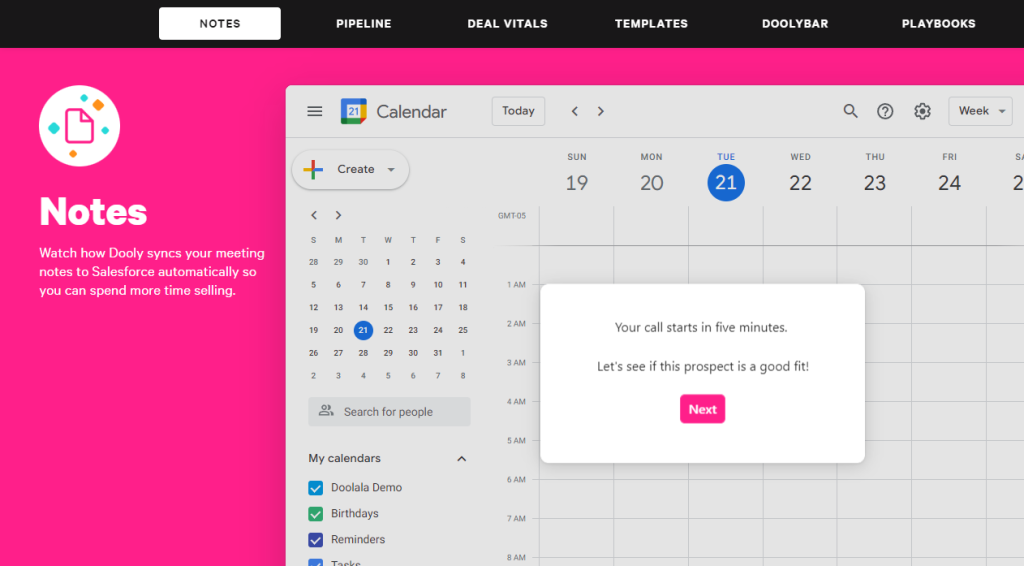
Dooly created a ‘Dooly in action' page which contains 6 separate demos: one for each core feature of their product.
Each one gives the user an ungated way to understand exactly how Dooly works, and see if it does what they need it to.
Each demo is ~6-20 steps, with an average of around 10; an appropriate length to strike the balance between being useful & not too long or overwhelming.
Breaking a product demo down into different features is much smoother user experience than forcing prospects through one giant demo which showcases every feature. It saves time, and lets prospects view only what they're interested in.
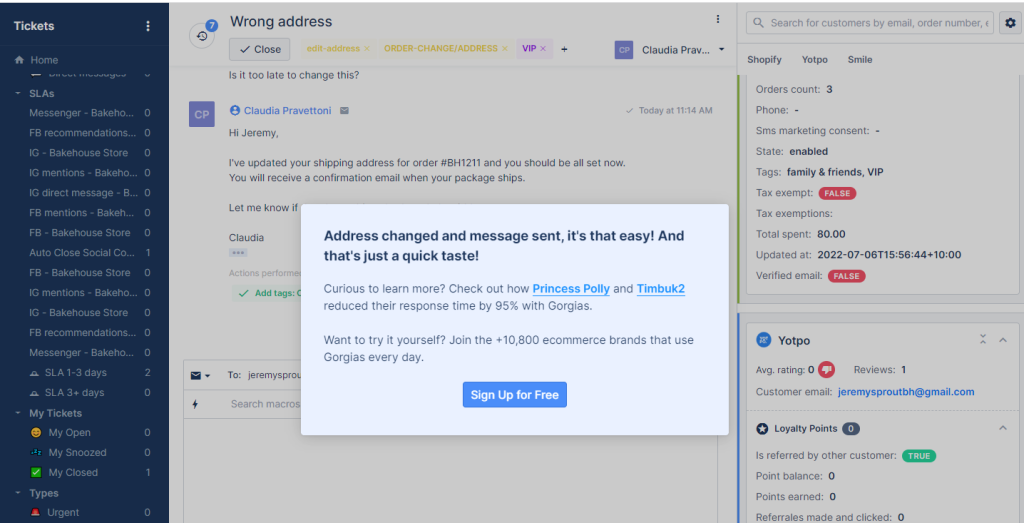
2. Gorgias
See it live: https://www.gorgias.com/product-tour
Made with: Navattic
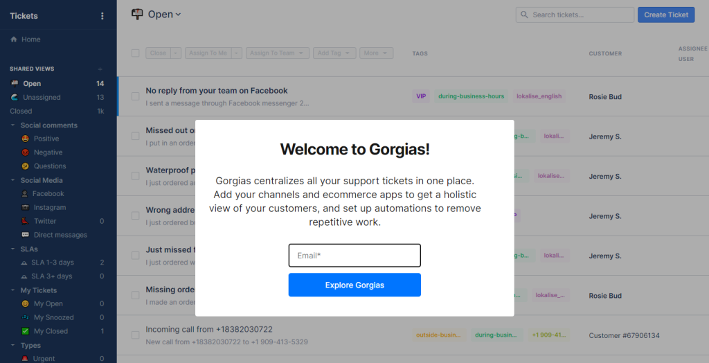
Gorgias have an example of a gated interactive demo which requires an email to view, although it's worth noting that Navattic enables ungated demos too — you can choose which you prefer.
Gorgias don't use ‘Take a tour' as the main CTA in their homepage hero section, but the tour is prominently available in their navigation under the first dropdown:
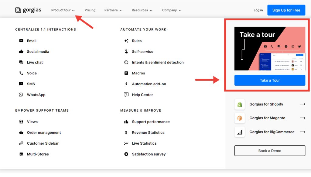
It's a straightforward walkthrough of the main features.
After the walkthrough, the end screen offers customer stories, and a sign up CTA.
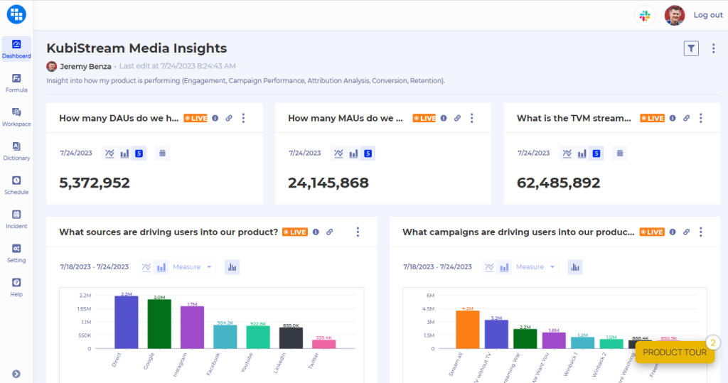
3. Kubit
See it live: https://kubit.storylane.io/share/rdkwuulyocy1
Made with: Storylane
Kubit use a “Take a Tour” CTA front and center in their homepage navigation:

And the first thing you see when loading up Kubit's tour is a checklist.
- Get an overview
- Click around on your own
- Choose a specific feature
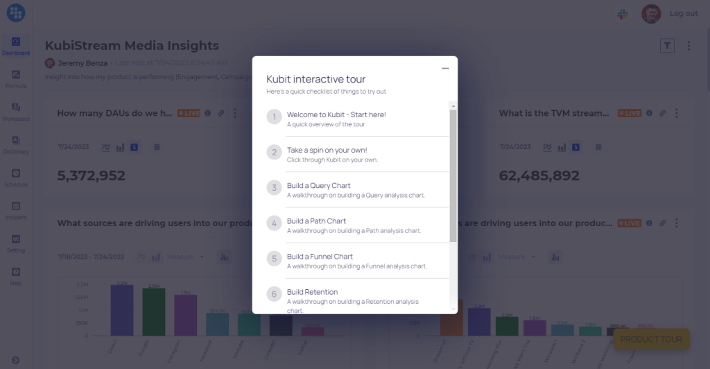
A great way to let customers skip what they're not interested in.
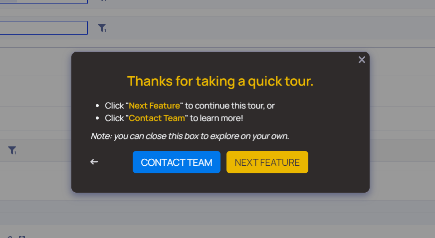
After finishing each section, two CTAs are offered: next feature (returns to the checklist) or “contact team” (leads to this free trial page).
4. Carta
See it live: https://twitter.com/cartainc/status/1405313492962455552
Made with: Arcade
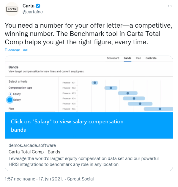
Carta uses Arcade's Twitter integration, creating interactive tweets which demonstrate product features, captured by Arcade's screen recording extension. Despite being a Twitter embed, these demos offer the same features as Arcade's regular web embeds.
This ability to interact with the product demo straight from social media minimizes the number of necessary clicks and drives viral growth. The Twitter embed format makes it possible to directly increase visibility through simple interactions such as likes and retweets.
The CTA button at the end of the demo redirects prospects onto the site's website in only one click, letting them learn more about the product and possibly request an in-depth, personalized demo.
5. Conquer
See it live: https://conquer.io/product-tours-demo/
Made with: Reprise
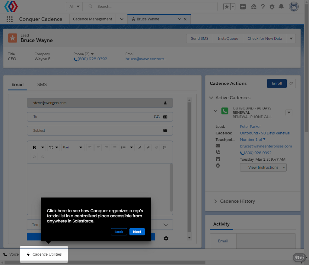
Conquer's website showcases three separate demos: one each for Conquer Cadence's agent and manager components, and one for Conquer Voice. This split lets prospects focus only on the use cases which they find relevant, saving a lot of time.
The demos themselves are elaborate and informative, with a high level of interactivity. Prospects get an opportunity to try all of the suite's key features for themselves in a direct, hands-on way. The only big downside is the length of the flows, which include too many steps without any real breaks or segmentation. This forces prospects to watch the whole demo in a single go, with no way to skip to specific sections.
The integrated CTAs at the end of each flow are a nice feature, letting the prospect take the next step and look deeper into the product straight from the demo, with the click of a single button.
6. AngelList
See it live: https://www.angellist.com/blog/safe-e-signing
Made with: Arcade
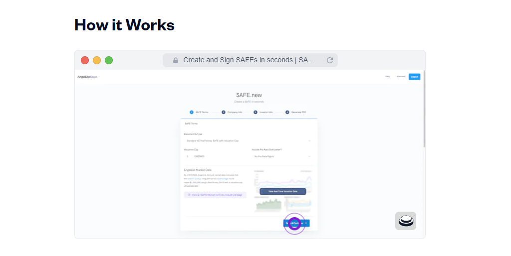
AngelList uses Arcade to create modal pop-out boxes that are embedded within blog articles. This approach lets prospects see demonstrations of new products and features in a way that's subtle and unintrusive, yet still effective. Such demos immediately show the value of the new product/feature without having to leave the promotional blog article.
These demos are great for getting straight to the point and demonstrating a process without much fluff. While product demos generally require a more elaborate approach, this is a perfect way to approach feature demos.
AngelList's embedded Arcades are activated by clicking on the overlay. In comparison to auto-start demos, this reduces intrusiveness and helps with focusing on the content.
7. Candidately
See it live: https://www.candidate.ly/fullscreen-tour
Made with: Storylane
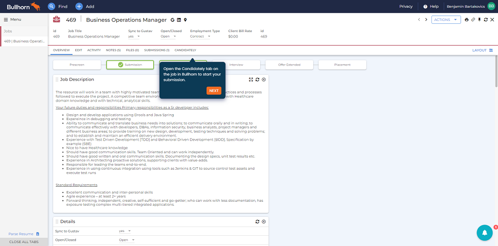
The Candidately team used Storylane to build a highly efficient tour of their product within only 10 minutes. Their interactive demo presents the platform's main features and functions in a single, brief flow made up of ~15 steps.
While the presentation itself is brief and minimalistic, each of the steps leaves a lot of freedom for the prospect to observe and play with the simulated environment. In many cases, this approach is more effective at helping prospects get a feel of the product than burying them in huge amounts of superfluous text.
Apart from the interactive product tour, Candidately's website also features a classic video presentation and the option to book a live personalized tour. The latter can also be reached through a CTA button at the end of the interactive demo, giving prospects the opportunity for deeper engagement straight away.
8. FORM
See it live: https://www.form.com/capabilities/team-task-management-tools/
Made with: Navattic
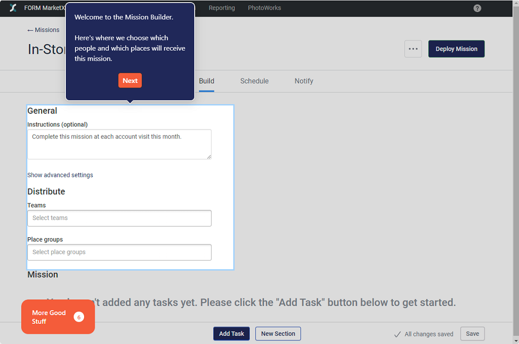
FORM uses six wholly separate demo flows that can be reached from separate sections of the webpage, each focusing on showcasing one of the tool's main use cases. While this lack of synchronicity may be jarring for some, it helps the prospect pick the use cases they're personally interested in and helps avoid information overload.
The flows themselves are highly interactive, going as far as letting the prospect use text boxes in a simulated environment. Meanwhile, the annotated info boxes provide a rich amount of information while staying concise and on-point. In that sense, this demo strikes a perfect balance between interactivity and information delivery.
While the flows remain at a mostly optimal length, the demo successfully manages to include demonstrations for both the desktop and mobile versions of the tool within the same flow. This is an excellent case of time-efficient delivery.
9. Centercode
See it live: https://www.centercode.com/tours/product-overview
Made with: Reprise
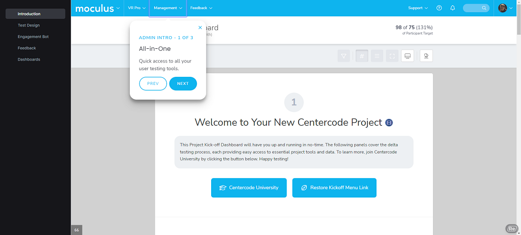
Centercode features a highly effective interactive demo that's featured in the most prominent section of their homepage. It's split into a quick introduction and four main sections, each demonstrating one of the software's main features. This utilization of Navattic's Chapters feature lets prospects jump between these sections at any moment by using the tabs on the left side of the screen.
The demo's narration is centered around Centercode's “engagement bot” called Ted. It proceeds by demonstrating the actions that Ted does in order to complete certain tasks and solve common problems. This method is very good at demonstrating the app's features, as well as being an effective tutorial.
At the end of each “Chapter”, the demo prompts prospects if they want to continue or schedule a guided demo. Such CTAs are very effective at getting the prospect to engage more deeply with the product.
10. BILL
See it live: https://www.bill.com/demos/smbdemo
Made with: Storylane
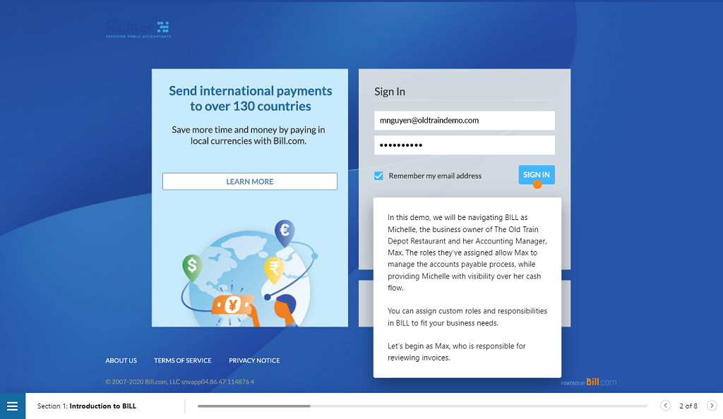
The BILL demo is split into six main sections, which you can easily jump between by using the table of contents at the bottom left. Each section is concise, each containing no more than 15 steps. Such a setup is perfect for navigation purposes.
The demo's narrative is about a series of issues faced by two characters: a small business owner and her accounting manager. Each section of the demo follows the way the duo uses BILL to solve these issues in a step-to-step fashion. This approach to feature demonstration is very effective at giving prospects an idea of what it feels like to use the software. Apart from that, it works wonders for tutorial purposes.
At the end of each flow, the prospects will see a CTA prompt where they can go straight to the product registration form. This encourages prospects to register right away instead of leaving it for later.
11. Open Raven
See it live: https://www.openraven.com/use-cases
Made with: Arcade
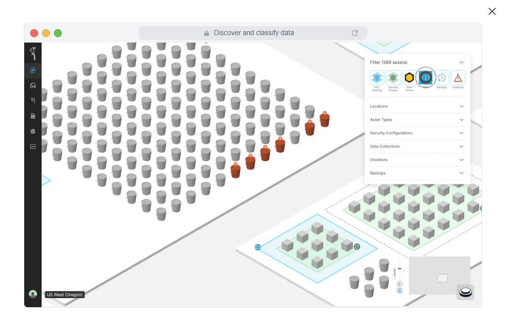
Open Raven uses a set of five separate Arcade demos, each demonstrating a particular use case. Each of them is a pop-out modal that will spread over the screen after clicking on it, giving prospects a closer view. This separation is also useful for analytics purposes, as comparing the number of views lets you see which use cases attract the most attention.
The demo recordings are brief but effective at giving an overview of each of the main use cases and the platform's key features. They make great use of Open Raven's heavily visual GUI, successfully demonstrating its function without using too much text.
The CTA button at the end of each flow lets prospects schedule a guided demo. This lets interested prospects immediately jump to an opportunity to learn more about the product.