The category of interactive product demo software is growing fast. Navattic & Storylane are among the emerging market leaders.
Both are fast to implement & effective at delivering product tours, but what's the difference between them?
We'll explore:
- The short summary (main differences)
- Pricing differences
- Integrations
- Time to implementation
- Multi-flow demos
- Lead forms
- Storylane unique strengths
- Navattic unique strengths
- Example demos built using each tool
Let's start with the ‘TL;DR'.
The difference between Navattic vs Storylane
The main differences between Navattic and Storylane are that:
1. Navattic's starting price is higher, but offers unlimited user seats. Storylane's starting price is lower, but bills per user seat.
2. Storylane has a broader number of features (e.g. AI assist & lead forms), while Navattic goes deeper on core offerings like HTML capture & quality support & mobile optimized demos.
| Reasons to choose Navattic | Reasons to choose Storylane |
| Unlimited user seats on every plan | Lower entry price & limited free version |
| Experienced white glove support | AI-assisted demo creation |
| Handling more complex HTML capture | Ability to include video in demos |
| Get a Navattic demo | Get a Storylane demo |
Navattic & Storylane pricing differences
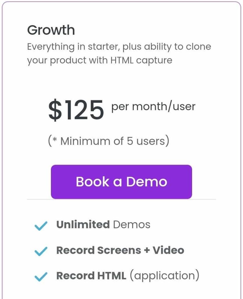
The main thing to understand is that Storylane has more flexibility at the lower end of the market. It offers an a plan with only screenshot & video capture (no HTML capture) which is cheaper, and per-seat billing makes everything accessible for small teams.
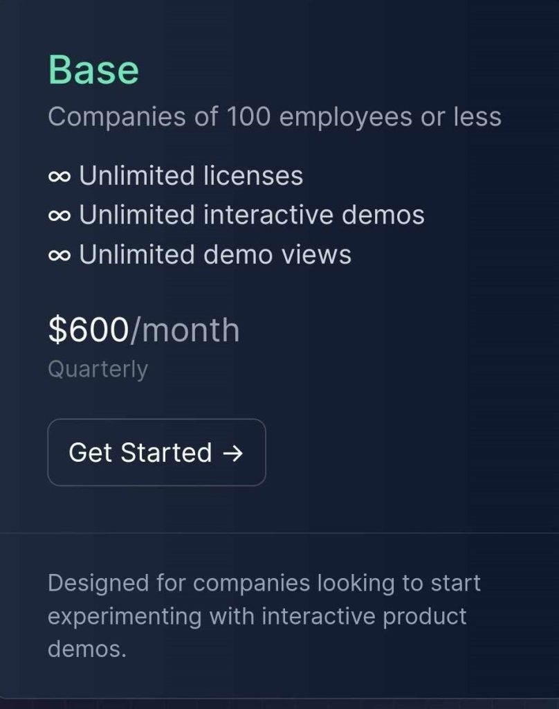
Navattic's entry point is higher at $500/month (but for startups with 20 employees or less, it drops to only $300/mo.) It doesn't offer an entry plan with less functionality. It's attractive for mid-market teams (and larger) though, because pricing doesn't increase for more seats.
If you want a similar service including HTML capture, the price for 5 user seats is exactly the same with each tool.
For 5 user seats in both tools, the price is $600/month (or $500 if billed annually). If you have fewer seats, Storylane is cheaper — if you have 6+ seats, Navattic is cheaper.
- Storylane's pricing is publicly available.
- Navattic's pricing is publicly available.
Should you care about having screenshots-only as a pricing option?
To be clear — Navattic & Storylane can offer both screenshots and HTML as demo capture options.
The difference is in packaging. Storylane offer a cheaper plan that excludes HTML, whereas Navattic only offer the “full” package.
So, if you're deciding between them, you could take a second to figure out if that matters to you.
The main advantages of HTML capture is that demos feel more realistic (you can tell if it's a screenshot), and that you can customize screens more easily. When you capture code, you can click into text & change it, or clean up data in charts (etc.).
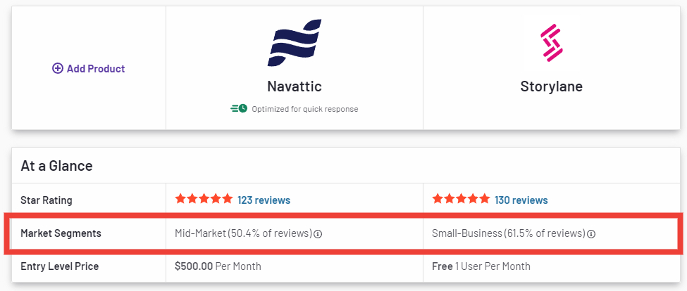
If that's not important to you, you could consider getting started with a screenshot-only tool for a lower price. SMBs often do that, which is likely why Storylane has a higher volume of SMB reviews, while Navattic has more mid-market customers (see: G2).
Integrations are mostly the same
Both Storylane & Navattic integrate directly with:
- Salesforce & HubSpot
- Marketo
- Zapier
- Google Analytics
- Segment
There are a few differences.
Storylane has a Pardot which can create new leads, or update leads with demo analytics. There's also a Slack integration which Navattic doesn't have, that can create pings for new known leads.
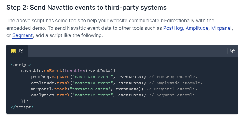
Navattic has Embed Events, which makes it easier to send events to tools like Mutiny, Mixpanel & other event-based analytics tools.
Lastly, Navattic also integrates with Chameleon — providing a way to launch tours from in-app buttons (if you use Chameleon).
Time to implementation is similar too
Navattic & Storylane are both on the faster end of the spectrum for implementation time. Both are likely be faster than a platform like Walnut, Reprise, or Demostack.
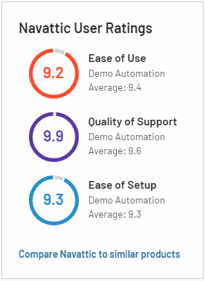
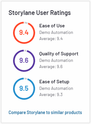
G2 reviews suggest that they're performing similarly, with a slight edge for Storylane on. Though it's worth remembering that some Storylane reviews are based on simpler screenshot demos (not HTML), which are inherently faster.
Either way, this isn't a decision-making factor in my opinion — both are good.
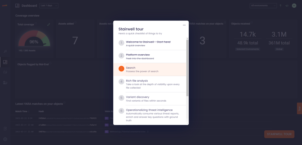
Both tools support multi-flow demos
Whichever tool you use, you'll be able to create non-linear demo journeys.
In Storylane it looks like this (example from Stairwell tour):
And in Navattic it looks like this (example from Mixpanel tour):
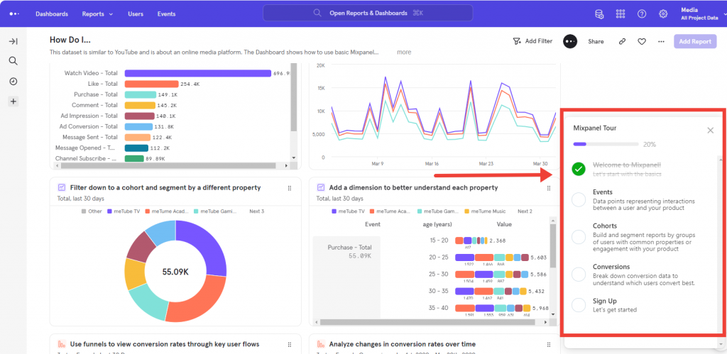
Pretty similar.
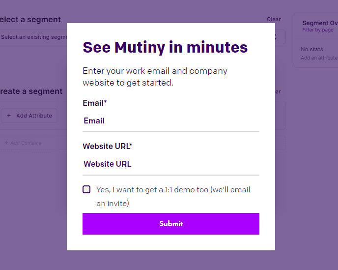
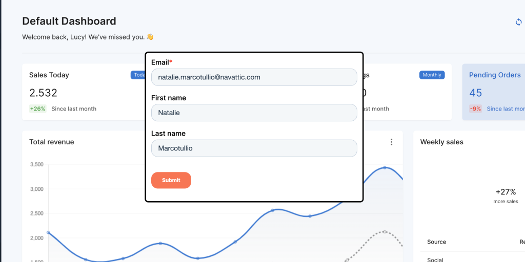
Both tools offer lead forms
In Navattic you can optionally gate your demo, check Mutiny's demo for a gated example:
And you can also create custom lead forms from your CRM. Here's a HubSpot example:
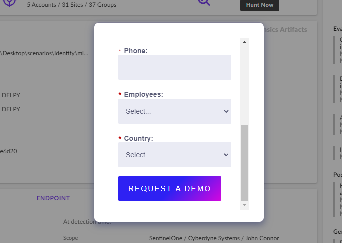
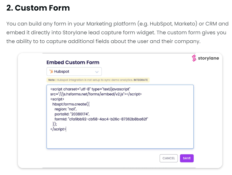
Storylane offers the same functionality. You can choose to gate demos, and they offer integrations that let you embed custom forms from your CRM or marketing automation tool. You can see a live example in SentinelOne's demo.
And, learn more about Storylane's forms here.
Storylane has AI-assist and video capture
These are two areas where Navattic doesn't have a comparable feature.
AI assist
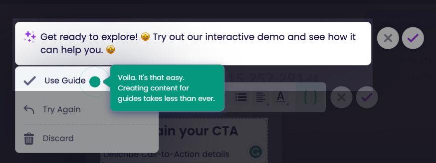
The AI feature in Storylane can:
- Write or improve text for each step of your guides
- Add AI voiceovers
- Translate text & voiceovers into 25 languages
Video capture
This one is pretty straightforward. In Storylane you can utilize videos within your demo.
That can be helpful if you want to speed through sections without forcing the user to click a bunch of times, or if you want to show some kind of complex workflow / animation.
Video capture is not possible in Navattic.
Navattic can handle more complex HTML capture
A potential limitation of HTML capture is that you run into issues with complex features.
For example: drop-down menus, 3D modeling, graphs & any non-standard elements.
Navattic does a good job of overcoming those, and they've got 3,000+ live HTML demo examples.
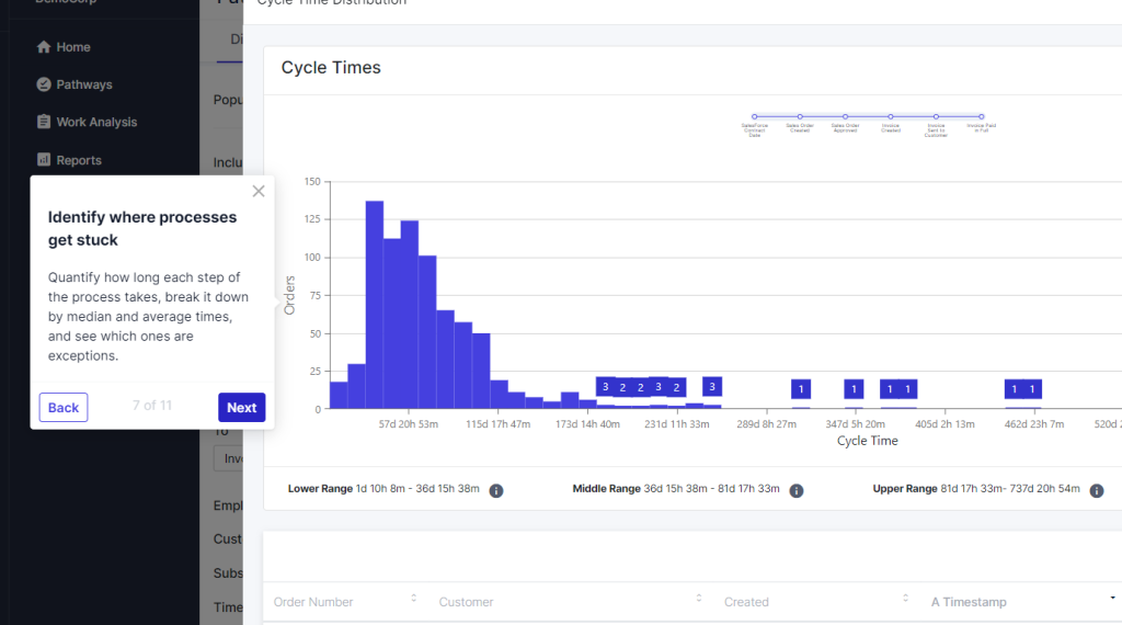
I don't have the “secret sauce” to reveal the technical reasons why Navattic can capture some complexities while others can't, but here's a few HTML captures with unusual features:
- SpotAI shows a video playing in the background
- Cognite: shows various 3D models
- Chassi: Various unusual graph elements
Navattic invest heavily in customer success
This one is a little subjective, but overall, I believe you can expect stronger support from Navattic.
(Not to say Storylane's support is terrible, by the way, just that Navattic's is better).
I'll explain why:
1. They have more “top tier” customers to learn from. Especially in mid-market / enterprise. Mixpanel, Drift, ClickUp, Demandbase, Citrix, Mutiny, Metadata, Ramp (etc. – see their Customers page). Their CS team learns from every interaction with those successful companies (and smaller ones, too).

Their learnings are reflected in content too. E.g. the State of Interactive Product Demos 2023 Report.
2. Every customer, regardless of plan, gets an interactive demo review. That means you'll get proactive strategic advice to make your demos perform better. Not just technical support, and not just for big customers.
3. “Big” customers get even more tailored coaching. If you're paying $1k+ per month, you get tailored demo coaching. Whatever your use case (e.g. marketing embeds, sales enablement, product marketing, conferences), you'll get tailored 1:1 coaching from someone who's previously implemented that successfully at other companies.
If it matters to you, the CS team are fully US-based, too.
Example demos
Curious what demos made with Storylane or Navattic actually look like? Here's a couple made by each tool.
Built with Navattic
Dooly
See it live: https://www.dooly.ai/see-dooly-in-action
Primary capture method: HTML
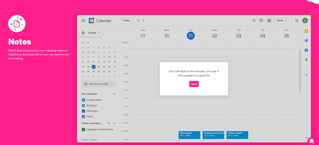
Dooly's interactive demo is split into 6 flows to showcase each feature. It's a straightforward walkthrough that gives the user an idea of how it looks/feels to use the product.
Gorgias
See it live: https://www.gorgias.com/product-tour
Primary capture method: HTML
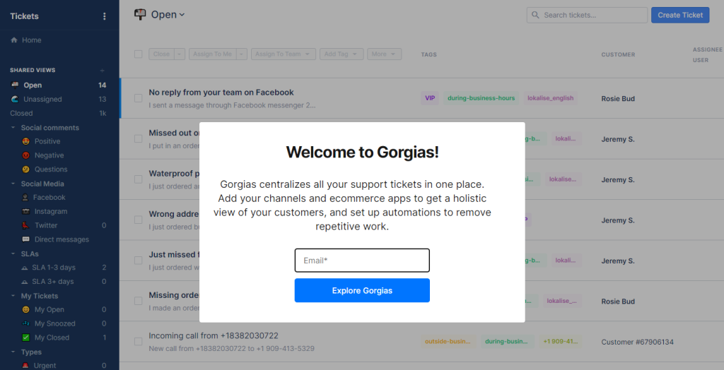
Gorgias have an example of a gated interactive demo which requires an email to view, although it's worth noting that Navattic enables ungated demos too — you can choose which you prefer.
It's a straightforward walkthrough of the main features, ending by offering customer stories and a self-serve sign up CTA.
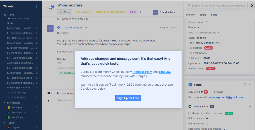
For a mobile demo built with Navattic, check out Slack, or read about Navattic's responsiveness strategies.
Built with Storylane
Kubit
See it live: https://kubit.storylane.io/share/rdkwuulyocy1
Primary capture method: HTML
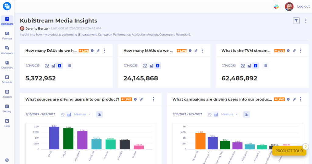
Kubit use a “Take a Tour” CTA front and center in their homepage navigation:

And the first thing you see when loading up Kubit's tour is a checklist.
- Get an overview
- Click around on your own
- Choose a specific feature
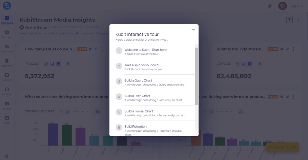
A great way to let customers skip what they're not interested in.
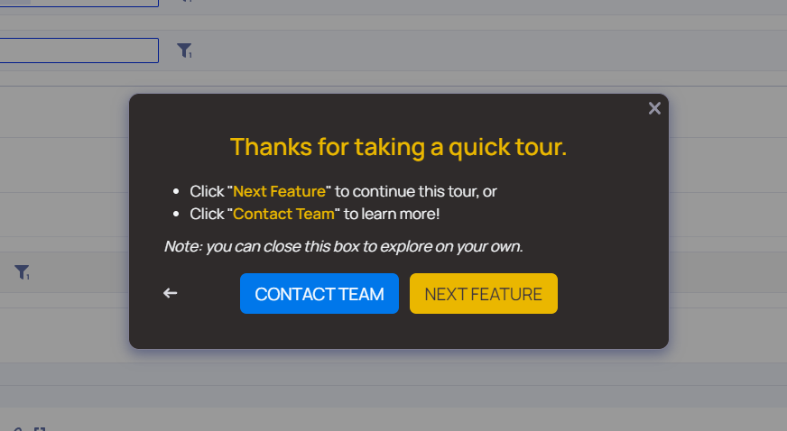
After finishing each section, two CTAs are offered: next feature (returns to the checklist) or “contact team” (leads to this free trial page).
Clari
See it live: https://pages.clari.com/clari-revenue-platform-tour.html
Primary capture method: screenshots
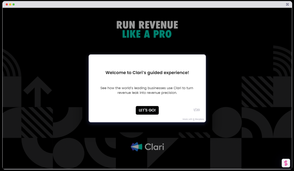
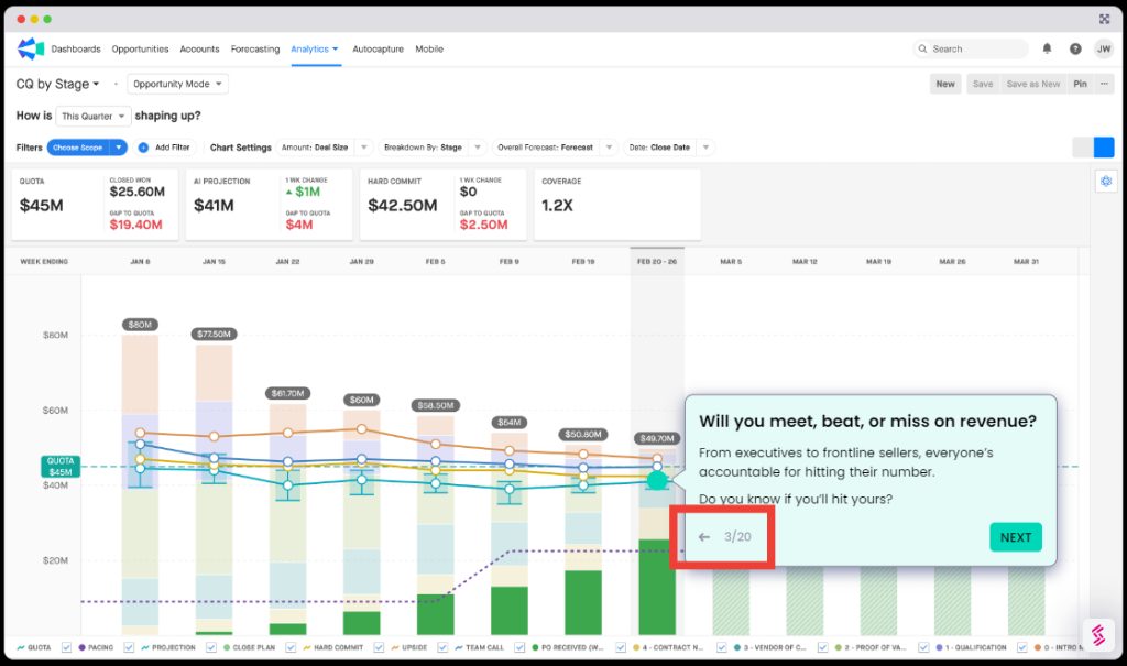
Clari's demo is good example of a quick & simple interactive tour. 20 screens, and linear. Something that could likely be created and launched within a day.
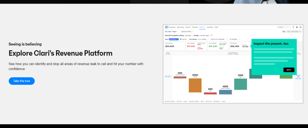
It's accessible from their product overview page, using a “Take the tour” CTA.
One small thing which is helpful for UX is showing the number of total screens, and including a “back” button.
Summarizing
Both are solid tools with happy customers, and growing fast. There's a good chance you'll have some success with implementing interactive demos either way. But there are some subtle differences in features & pricing models which might make the difference.
If you need something to start small & grow later, Storylane could be a good fit.
If you have a more complex product, with multiple use cases for HTML & CSS capture, Navattic is likely to be a better fit.
Both tools are also developing fast, so be sure to check for recent updates if you're reading this a few months past the publish date 🙂

